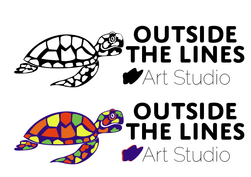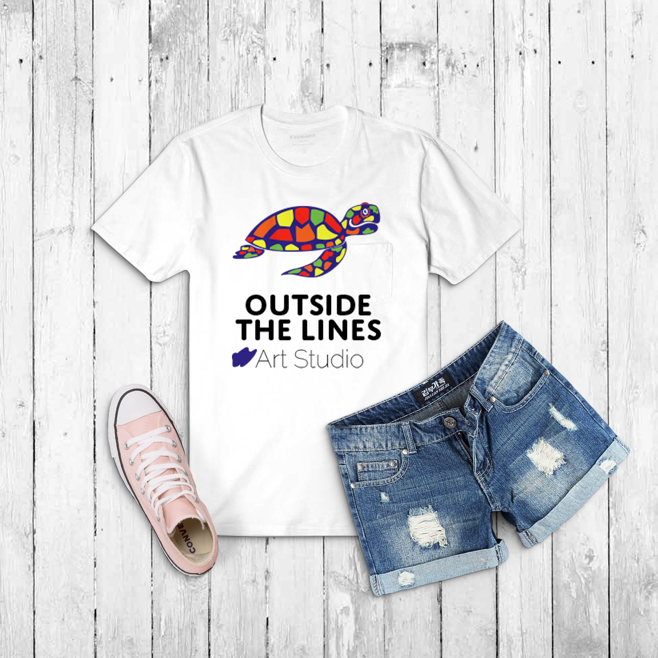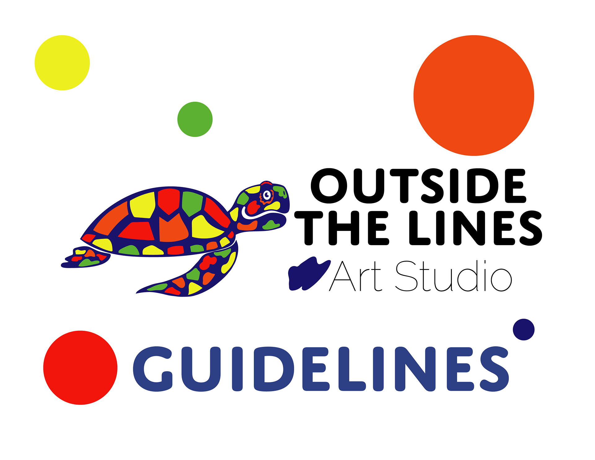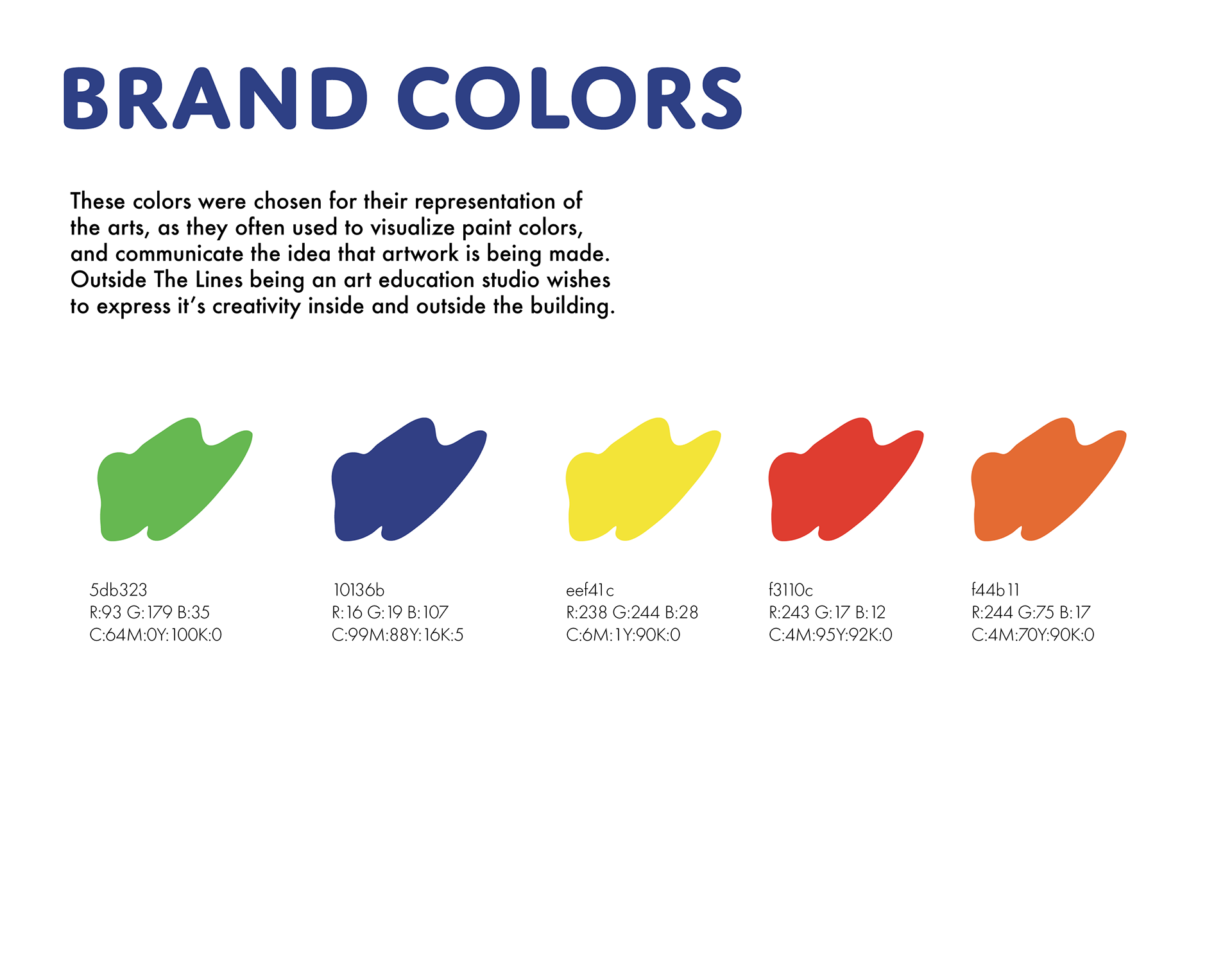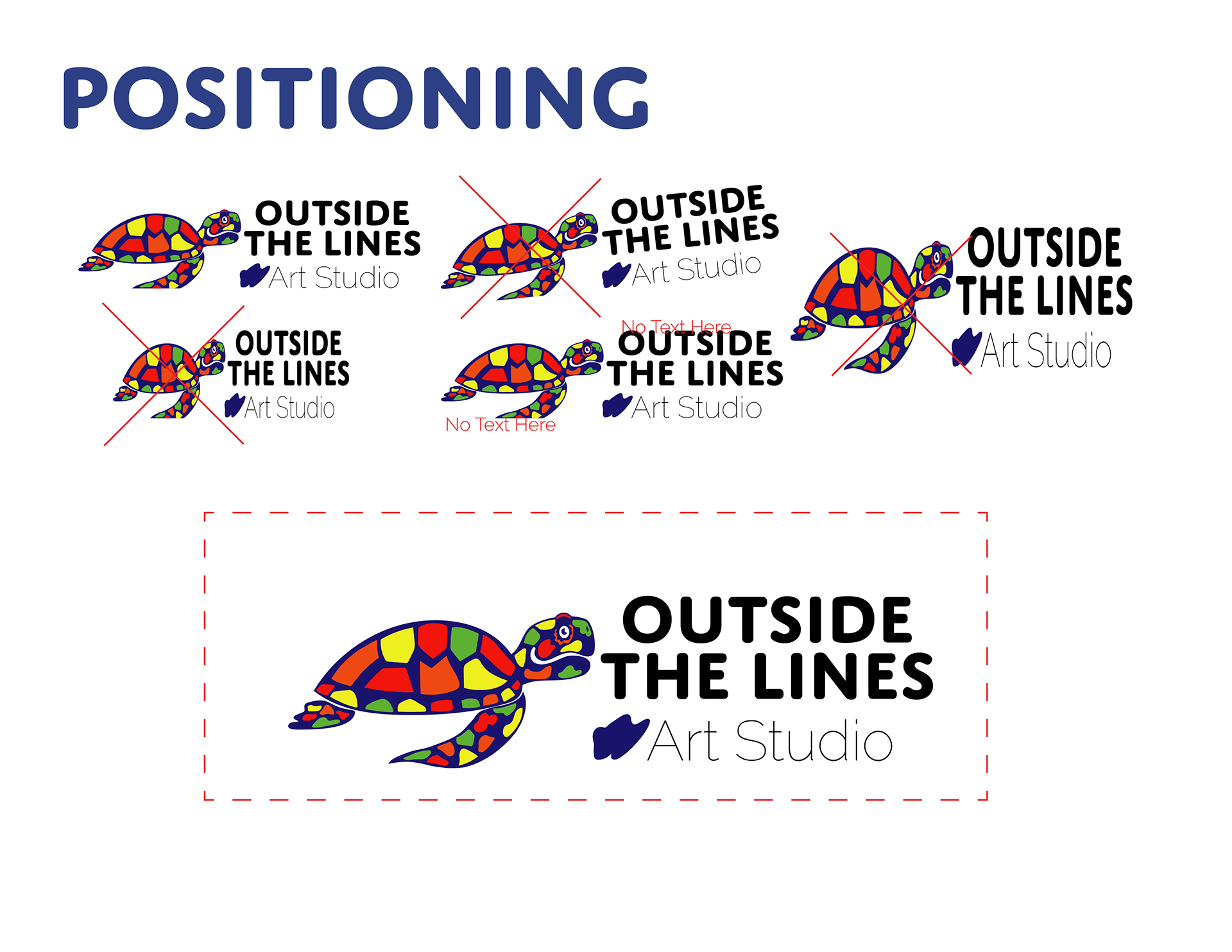
Brief: I worked with an art teacher named Danielle, who wanted to branch out and create a studio for all ages alike. The logo was required to include a sea turtle and an artistic feel, with both print and web application.
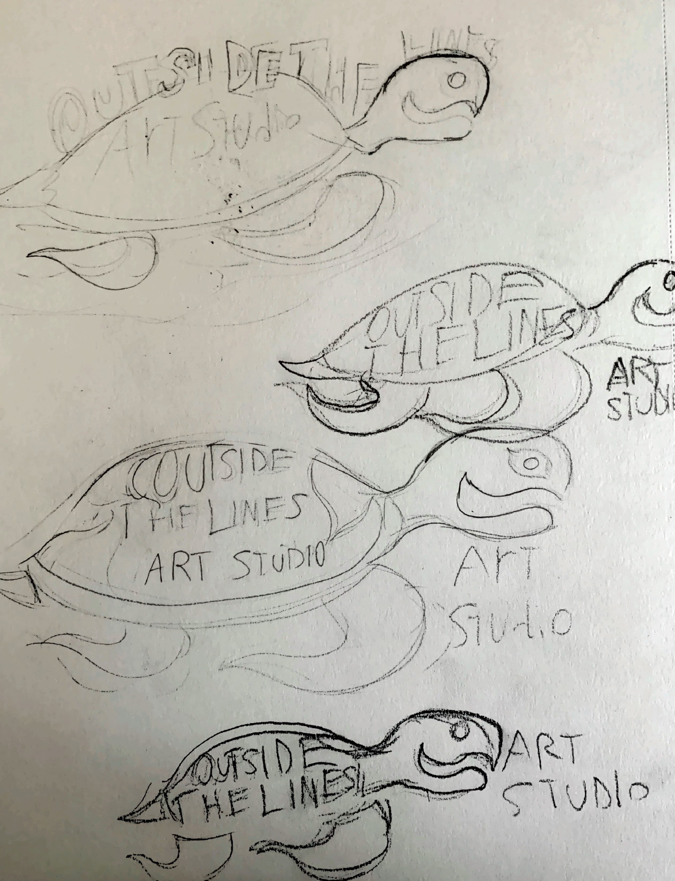
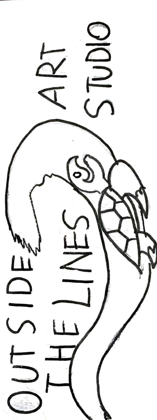
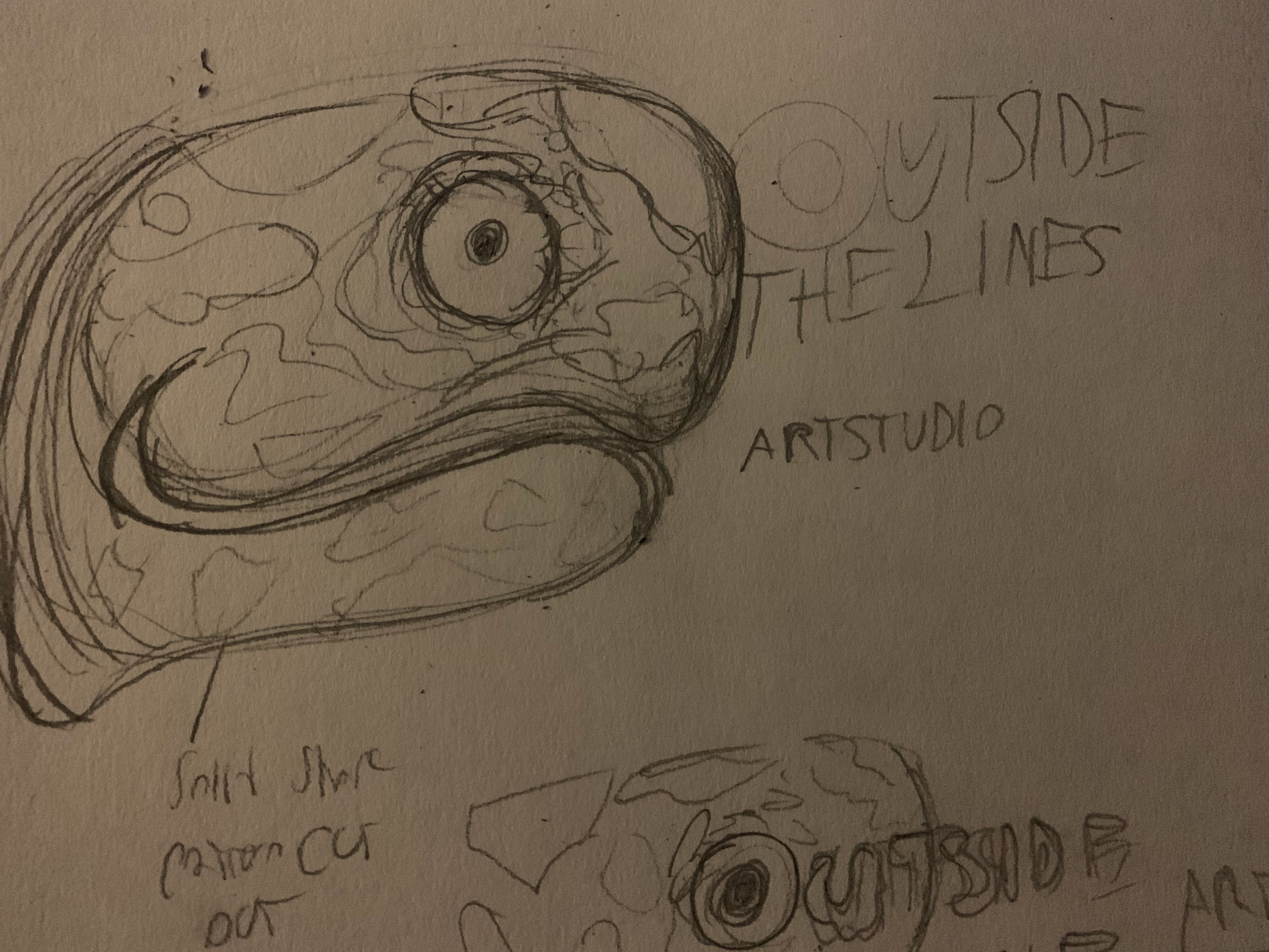
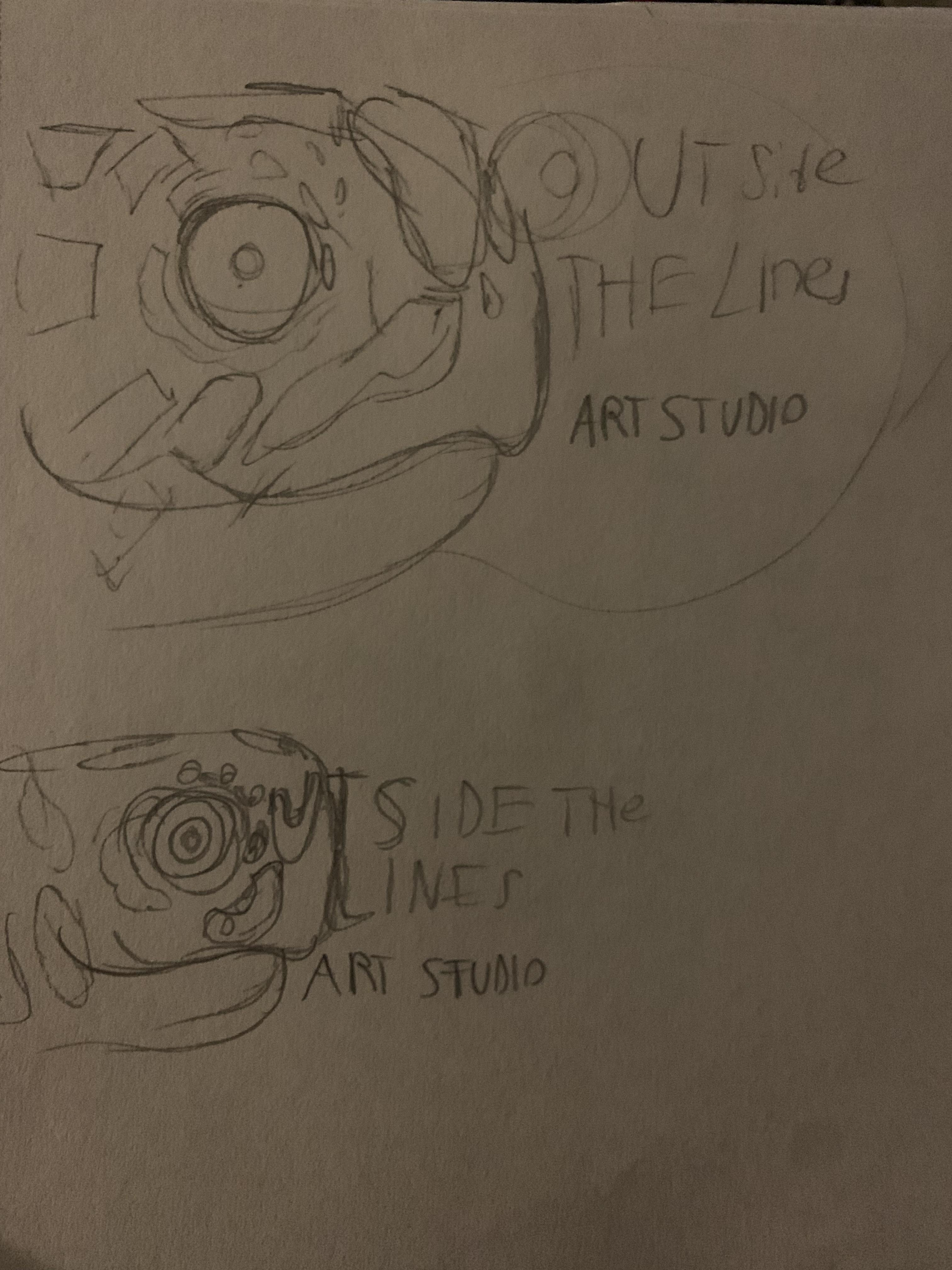
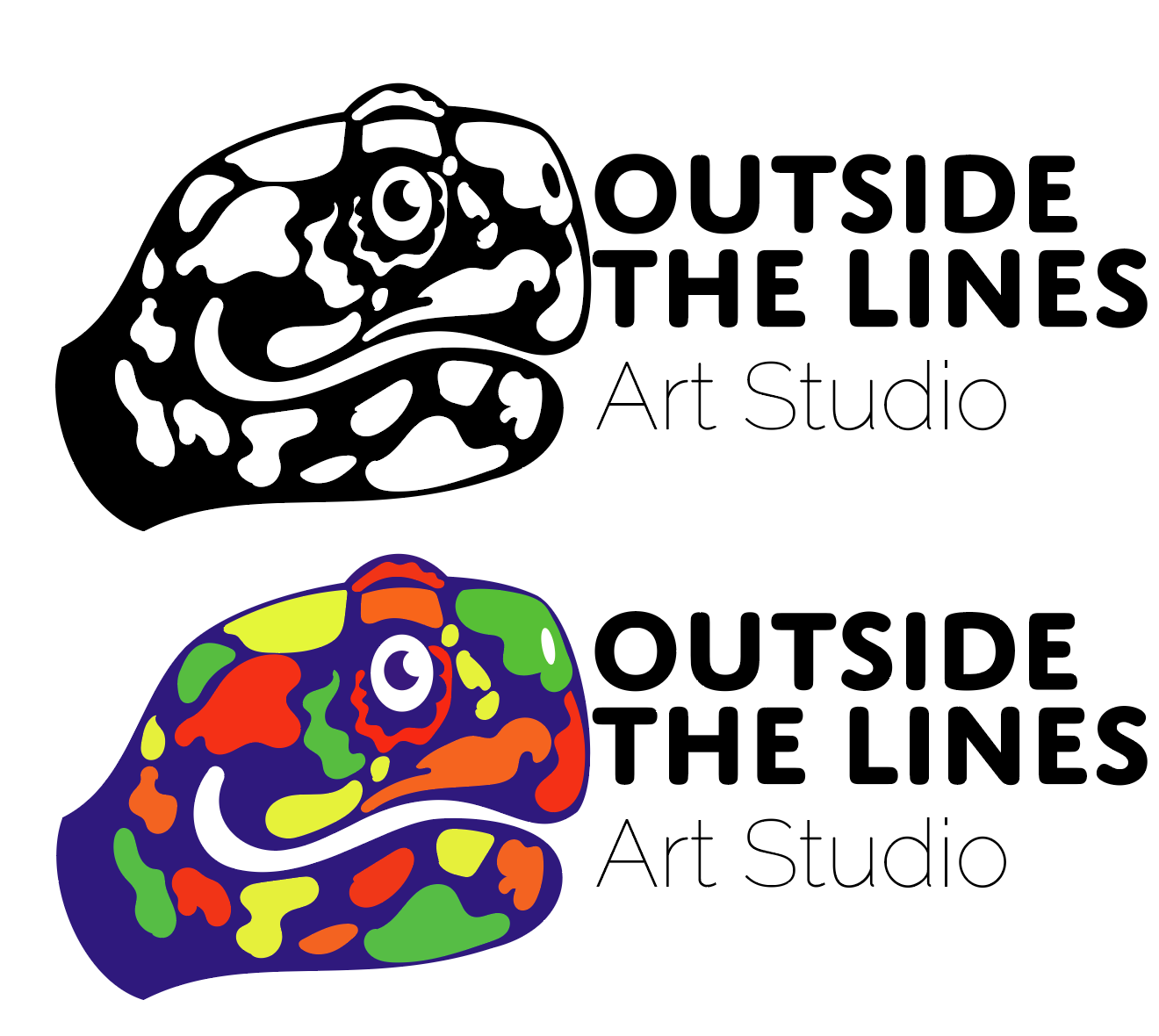
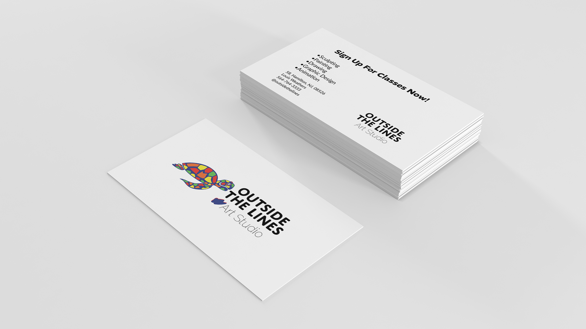
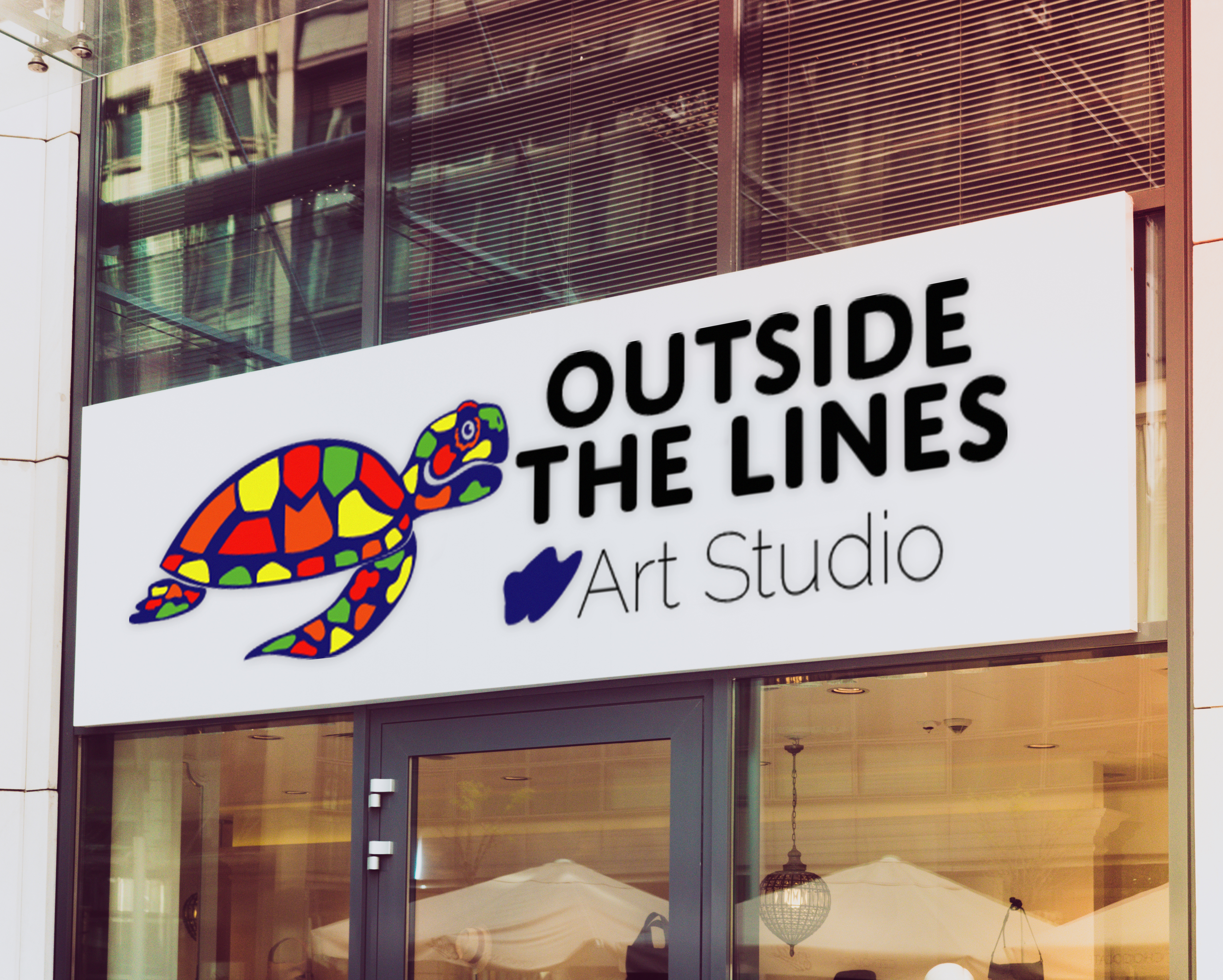
Execution: the identity I created was entirely new and would serve as the studio's display sign, logo, and appear on the website. My client had a rough idea of what she wanted the outcome to be, a playful design that encompassed the arts and featured a sea turtle. I went back and forth showing the early stages with rough hand drawn illustrations, to get a better sense of how to approach it. Danielle took to the third style of illustration I created, featuring a cartoon like expression and a colorful paint blob pattern. I chose a bold sans serif font for the studio's name to match the thick line quality of the mascot logo, and a light sans serif font to communicate the profession. The end result was a combination of the cartoon style turtle head and the fully body from previous designs along with an added splash of paint to connect it to the type.